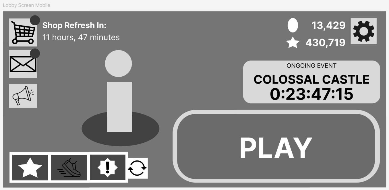
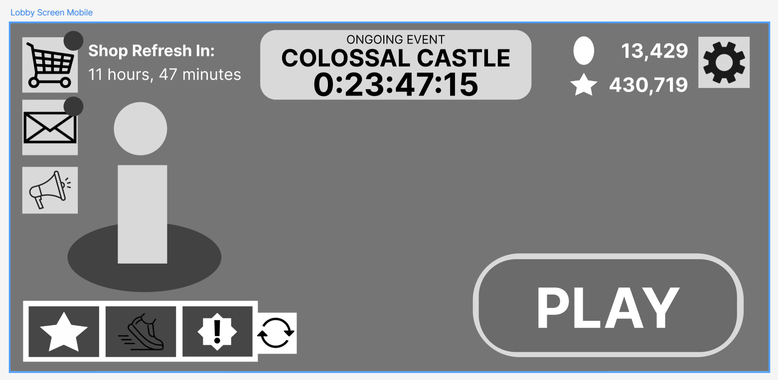
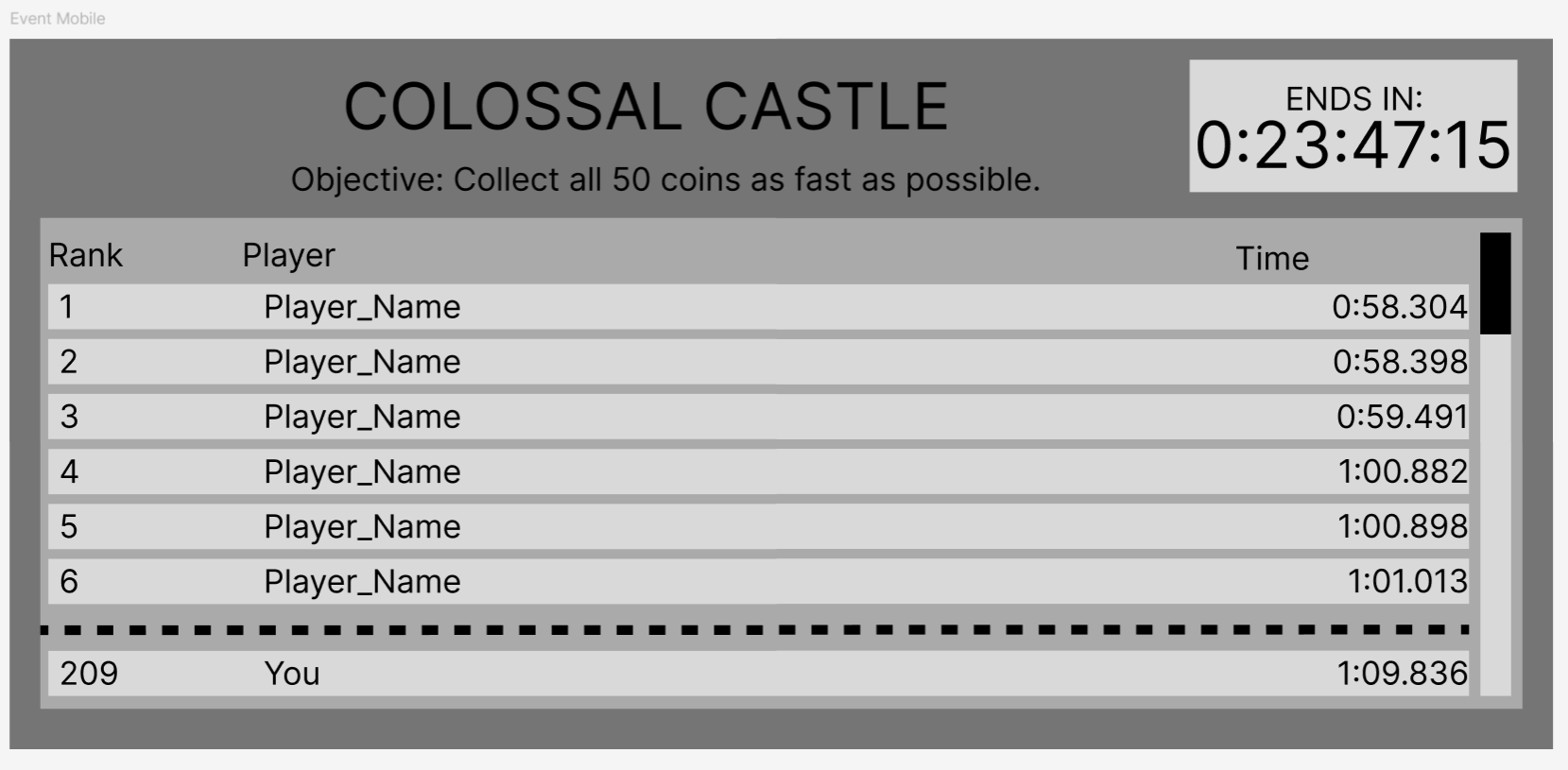
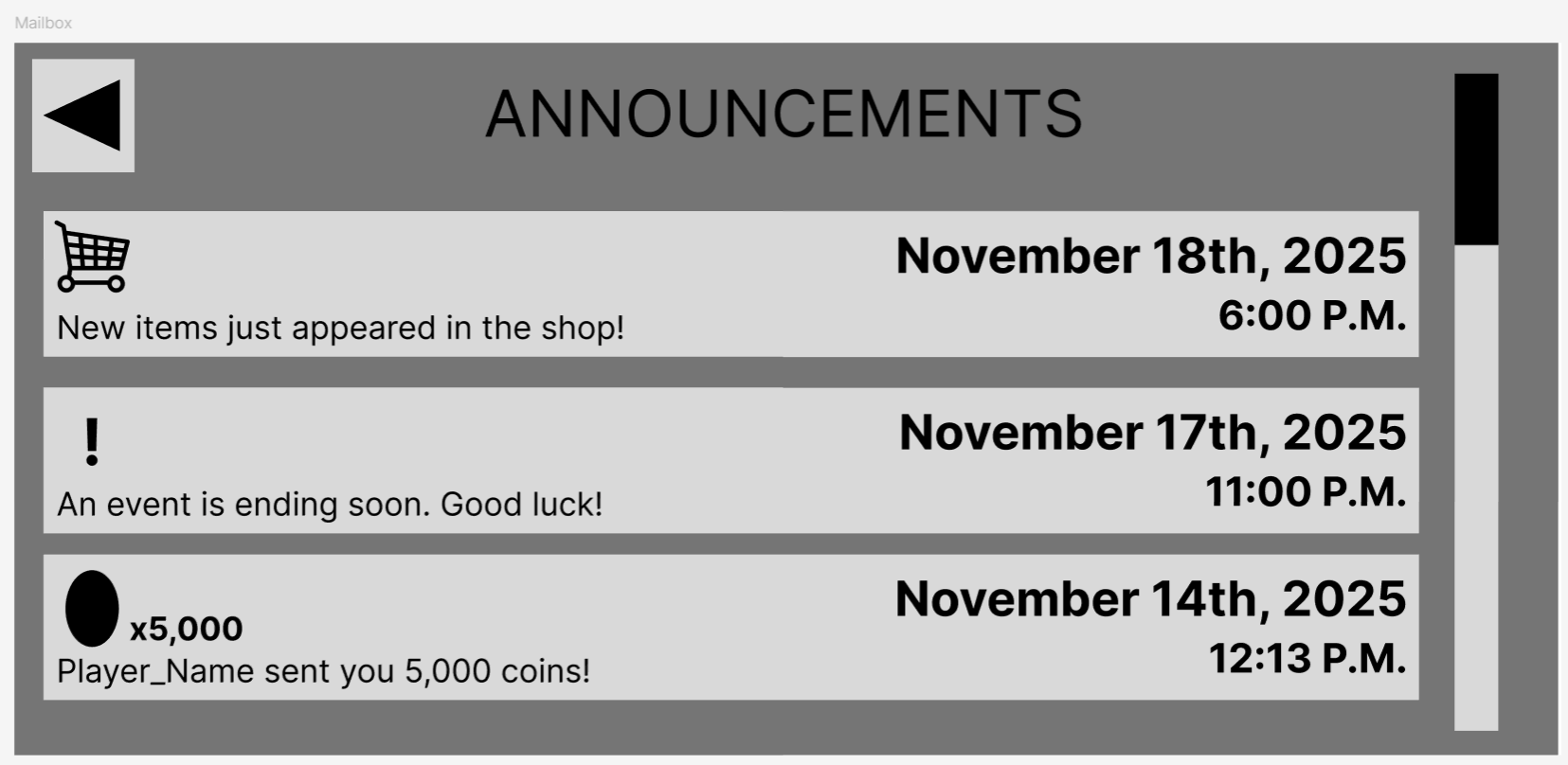
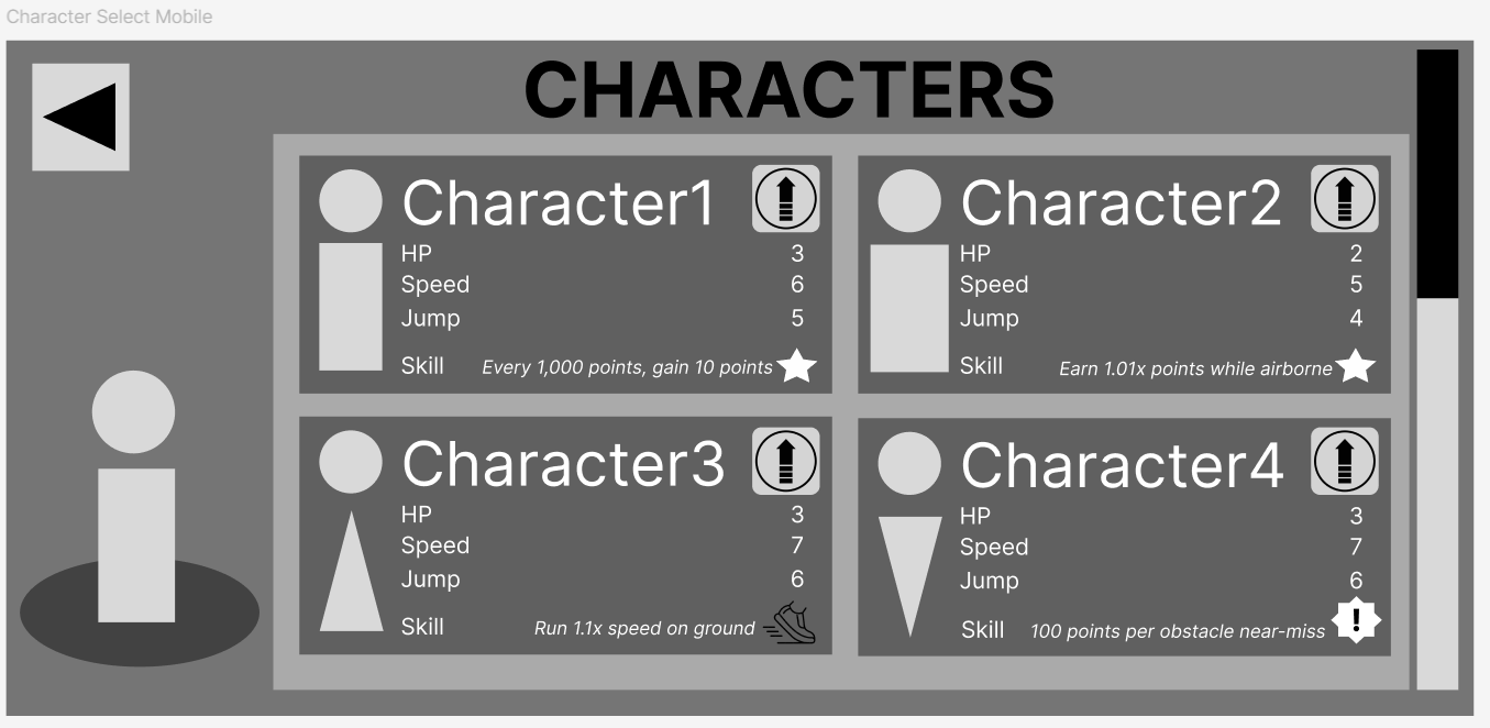
Mobile UI Design

Take a look at some User Interface mockups for a mobile game I’m working on as part of a project team at DigiPen.

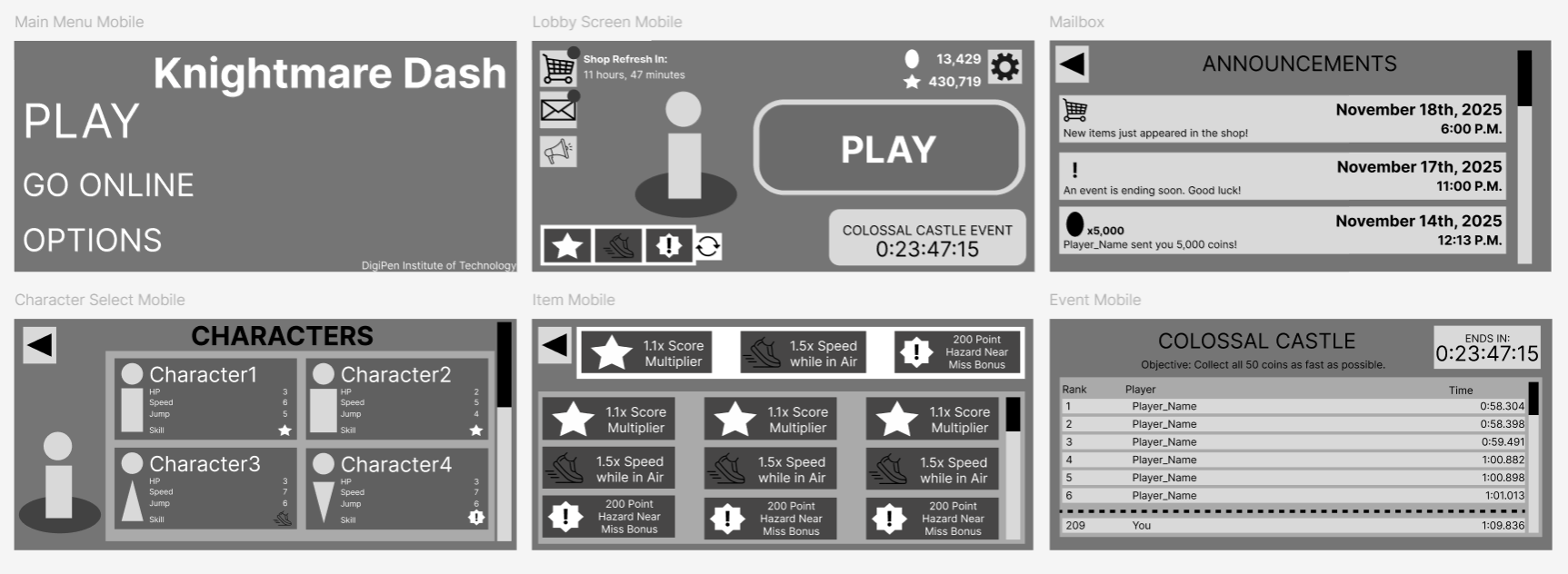
This is an infinite-runner game where the player can equip gadgets to give them abilities. There are also Limited-Time Events that players can compete in.

Here are two versions of the main menu. It was important for the “PLAY” button to be the most prominent thing on the screen so the player could start a new run easily. After placing the PLAY button, the rest of the important elements fell into place around the screen.

Ultimately, the team preferred the second version, as having more negative space allowed the screen to breathe a bit more. The PLAY button didn’t need to overwhelm the screen to be prominent, and having the “EVENT” button in the top-middle isolated it from the PLAY button, making it clear that playing the Event was a different activity altogether.

The Event Button would lead to this screen, where the player could see a Live leaderboard of the top players in the event. Most of the width of the screen is reserved for the name of the player, which could potentially be very long. Each leaderboard entry doesn’t need very much space for the Rank or the Time.

The Announcements screen shows the player important information about the game. It’s important for the player to be able to identify at a glance what each announcement is, hence the icons on the far left of each entry.

The Character Select screen changed a bit between versions. The significant differences were describing explicitly what special ability came with the character beyond just the symbol, and providing an upgrade button for each character as well.

Each of these screens were crafted from the perspective of the player. Deciding what information the player needs to know and where they want to have it presented to them helped me shape the experience of navigating this mobile game.